


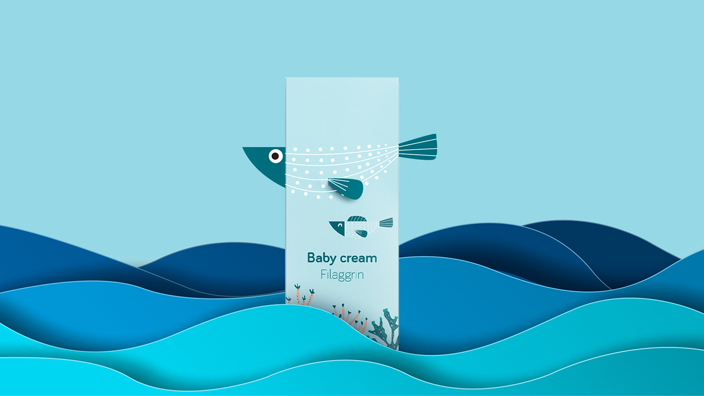
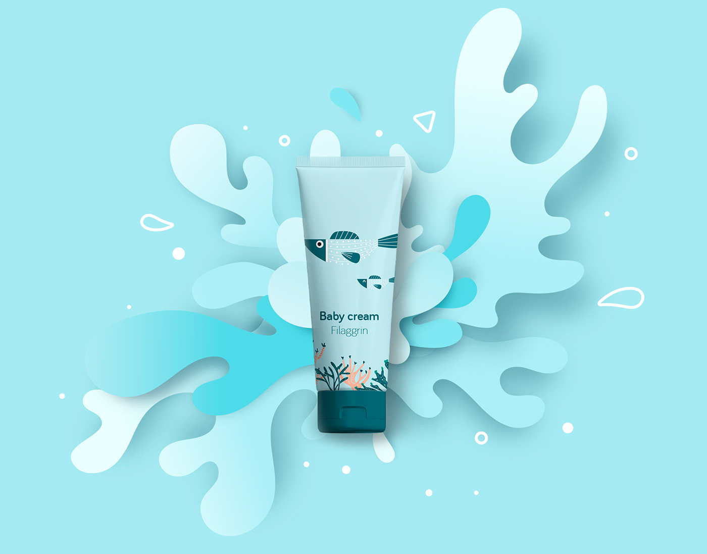
This packaging design is based on the idea that the brand has developed a high-quality skin care product derived naturally from the essence of green and red seaweeds off the coast of France. The box simulates the sea with seaweeds at the bottom, which brings to mind the natural origin of the product. The main element is a big fish created by an elegant premiun dieline that makes our product stand out in the point of sell. Next to the big fish there is a baby fish, an illustration that evokes the concept of motherhood, care and love. The body shape of the fish subtly hints at a smile, evoking positivity. Both fish, as we mentioned before, are in the sea, which reinforces the idea of hydration. The pastel colors and rounded shapes evoke the concepts of care, motherhood and love.
On the one hand, my design conveys, in a friendly, sweet way, the idea that this is a new premium product, which will persuade mums that this new range is the best for their precious babies. It is a really new design, totally different from other current designs and other brands; it stands out at the point of sale, and it prompts the concepts of care, protection, love, affection, hydration, and natural origin in a simple, elegant and eye catching way.
The way to convey the feeling of premium in this case is the packaging design itself. The use of the dieline defines the shape of the fish in such a simple and elegant way and the materials show a very luxury box, and at the same time, the illustration transmits the concepts of care, protection and love. This clearly makes it a luxury product compared to other cream cans that only use conventional formats, with just an illustration and the name of the product.
In order to make the dieline work the main material must be cardboard or some type of rigid paper so that it can be mounted but at the same time not be too fragile. The paper should have a soft touch finish. The plasticized Soft Touch, on the one hand, is used to protect the product and, also, it has tactile properties that make it totally different. It seems like an elegant product, and most importantly, soft to the touch, which in our case is very important since we are designing for skin care products. It conveys a very pleasant feeling of luxury and exclusivity. The soft and velvety texture of the Soft Touch finish gives the packaging sensory connotations that differentiate it from the rest of the packaging. It awakens sensations in the consumer, who will value the product favorably and reinforces the concepts of care, hydration, protection, care and love that we want to convey.


Awards:
🏆 Third Prize on an globally design contest for a chinese brand


